Thursday, June 28, 2007

Summer 2007

week 7:
evening—06/25
morning—06/27

Hi students,
First, let me mention a bit of bad news:

For all of you who come in to class late (and you know who you are), let this serve as a warning, you will not be counted present in the next classes if you come in more than 30 minutes late. This is more of a problem during the day, and you must know that after 3 absences, the computer will automatically withdraw you from the class. As a result, you will not get a grade. It is becoming a big problem, and I want it to stop. You are all adults and so you must make the decision to stay in my class or not. If you wish to stay, then you must be responsible and get yourself up early enough so that you can get to class on time. It is a sign of respect to me, to the others in class, and to yourself. I truly care about your future and am willing to bend over backwards to do whatever I can to help you, to stay after class, meet you before class, even on weekends if you are desperate (and how many other instructors at TCI have websites for their classes?), but you have to show me also that you care about your own future. Make an effort and it will pay off. In 7 more weeks, you will no longer have to be in the class. But, if you hate the class so much that you find it difficult just to drag yourself in, then perhaps you should reconsider your major.


Now the good news:
I am extremely impressed with much of the work so far; but even more than that, the level of enthusiasm and interest (particularly of the evening students this term) makes me even more eager to help and put in more effort myself. For any of you, please ask me for additional assistance if you have any questions about how to do things I haven't addressed in class, or even those things I have addressed but which you require more information. Please keep working hard, practice and experiment with the things I have taught in class, and with other things that I haven't done. Don't fall behind.

Six classes remaining...and counting down...


  1. TOPICS:
    1. Fade-In/Fade-Out—Night Sky;
      • LINK   LAYERS: review layer stacking order;
      • LINK   TRANSITION: fade-in to a scene;
      • LINK   TRANSITION: fade-out from a scene;
      • LINK   TITLE: fade-in/fade-out of title;

    2. Complex Symbols:
      • LINK   nested symbols—symbols within symbols;


  2. HOMEWORK:This week, work on your animation projects. We will be working on these animations from now until the end of the term. The assigned homework is always going to be the minimum amount you should accomplish during the week, so I highly recommend you do much more each week. DO NOT skip a week without working on your project. It will cause you to fall behind, and you will regret it at the end of the term when you get your grade.
    • Complete the fade-in/fade-out sequence, including the title, for your animations.
    • Regarding your characters: convert them all into movie-clip symbols.
    • Work on the panning and push-in mostions as demonstrated in class and in this week's posting. If you are not successful with this, that is all right, but please make an attempt to do it.
    • Work on creating complex symbols for your characters as demonstrated below in this week's posting. We did not cover this in class, but go ahead and try it for yourself. Also, if you want to try to animate your dog's and cow's heads as well as the cat playing the fiddle within the movie-clips, then great. The more you try to do the better. If it does not turn out the way you want, then just save with a different name and show me in class. I will then be able to help you do what you attempted.

  3. STORYBOARD: below you will find links to each of the pages of the storyboard containing 3-frames each.
    • LINK   Frames 1-3
    • LINK   Frames 4-6
    • LINK   Frames 7-9
    • LINK   Frames 10-12
    • LINK   Frames 13-15
    • LINK   Frames 16-18
    • LINK   Frames 19-21—not yet complete
    • LINK   Frames 22-24—not yet complete
    • LINK   Frames 25-27—not yet complete
    • LINK   Frames 28-30—not yet complete

     
  4. NIGHT SKY: In this week's class we created the very beginning of our animation that you will work on for the remainder of the term. We did the first three frames from the storyboard above and here (LINKFrames 1-3). The idea is to read the text next to each drawing in the storyboard to find out what happens, and then to look at the picture to see what the viewer should see.
        As you should read, the first thing it says is FADE IN; but we also have to know what to fade-in TO. All we have to do to find out the answer to this question is to look at the picture to the right, and we see that it is a night sky. It also describes what we see in the text to the left. Before we get to the actual fade-in, however, we must draw and create the scene.
        In the following steps, I assume that you have already drawn your scene, and so will not go through steps of how to create the shining stars. If you need to know how to do this, you should click the following link to last week's posting (LINKweek 6) We'll start by arranging the layers in their proper order.


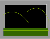
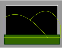
    1. Layer Stacking Order: what you see above is the final result. In order to get there we must first put all the necessary symbols on the stage in their correct layer. Then we must put the layers in their correct order so that the correct one is on top of the others.
      1. Name the first layer stars.
      2. Open the library (F11), and drag the star movie-clips into this first layer.
      3. Once you have placed enough stars on the stage to your liking, lock, the first layer and add a new layer.
      4. Name the second layer title.
      5. Drag the title symbol into the second layer.
      6. Lock the title layer.
      7. Add a new layer and name it fade.
      8. Choose the rectangle tool (R) and draw a black rectangle that covers over the entire stage.
      9. Choose the selection tool (V) and select the black rectangle by double-clicking on it.
      10. Convert to Symbol (F8), name it fade, and choose graphic for type. The image shows the way your layers should now look.
       
    2. Fade-In: what you see here are the way the layers should be stacked and how that should make the stage look. Now we must start the animation.
      1. Click in frame 20 of the fade layer and add a keyframe.
      2. In frame 20, Select the rectangle on the stage by clicking one time on it.
      3. Open the properties bar and change the alpha to 0%.
      4. Right-click between frames 1 and 20 select create motion tween. This creates the fade in.
      5. Now, click in frame 20 of the title layer and extend the duration (F5). Repeat this step for the stars layer also.
       
    3. Fade-Out: Now that we have the Fade-In portion of the animation, let's set up the Fade-Out part.
      1. Next, click in frame 70 of the fade layer and add a keyframe (F6) to begin the fade-out sequence.
      2. Then, click in frame 80 of the fade layer and add a keyframe (F6).
      3. In frame 80, select the rectangle on the stage by clicking one time on it.
      4. Again, open the properties bar and this time change the alpha to 100%.
      5. Right-click between frames 70 and 80 select create motion tween. This creates the fade out.
      6. As before, extend the duration (F5) of the other two layers.
      7. Lock the fade layer.
        Below you will see an image of how your timeline should look. Notice there are only two motion tweens so far, one at the beginning and one at the very end:


    4. Title Fade-In/Fade-Out: At this point, we have the opening and closing of this very first scene: the fade-in/fade-out sequence; however, we do not have the title fading in yet. If you read FRAME 2 of the storyboard, you will see that the title fades-in over the stars, and then fades away again. This is our next step.
      1. Since the title doesn't begin to fade-in until after the stars and sky have already faded-in, we won't begin the title fade-in until frame 20. That will be where the fade-in begins. Therefore, since the motion tween begins there, click in frame 20 of the title layer and add a keyframe (F6) to begin the fade-in sequence of the title.
      2. So let's think about this: since the title doesn't even begin to fade-in until frame 20, it does not even need to be there at all until then. As it is, however, it is already inframe 1. We do not need it there. Therefore, click in frame 1 of the title layer and delete the title from that frame.
      3. Good, now the title doesn't even arrive into the animation until frame 1; however, at this point it should not be visible. It should only gradually become visible starting here, in frame 20. That means that in this frame, frame 20, we must changle the opacity of the title. To do this, choose the selection tool (V) and select the title on the stage.
      4. Next, open the properties bar and change the alpha to 0% to make the title invisible.
      5. After about 20 more frames, the title should be fully visible, so click in frame 20 and add a keyframe (F6).
      6. By this frame, frame 40, the frame should be fully visible; however, as you can see, it is still invisible. Therefore, with the selection tool (V), click on the little circle in the middle of the invisible title symbol on the stage to select the title.
      7. Then, open the properties bar and change the alpha to 100%.
      8. Right-click in between the two keyframes in the title layer, between frames 20 and 40, and choose add a motion tween. This will complete the fade-in of the title. Next then is the fade-out portion.
      9. We must allow some time for the viewer to read the title and let it sink in, about 20 more frames. Only after that point in the timeline does the timeline begin to fade away again. That means that the fade-out begins in frame 60 of the timeline— click in that frame in the timeline and add a keyframe (F6).
      10. The fade-out of the title will go a little faster than the fade-in, so it will take fewer frames, only about 10. So, click in frame 70 of the title layer and add another keyframe (F6).
      11. By this time, however, the title will have completely disappeared again, which means we must reduce its opacity. Using the selection tool (V) click on the title on the stage in frame 70 to select it. Then open the propterties bar and reduce the alpha to 0%.
      12. Finally, in the title layer in the timeline, right-click between those two keyframes, frame 60 and frame 70 and select add a motion tween. This should conclude the fading-out of the title.

        Below you will see the timeline as it appears at the end of these steps:


  5. CHARACTER SYMBOLS:
    1. Graphic Symbols—making the entire drawing one single symbol:


      1. After you have drawn your character, select the entire drawing (if there is nothing else on the stage, click in frame 1 of the layer to this).


      2. Click on F8 to Convert to Symbol.


      3. Give it a unique name (name it dog), select graphic for behavior, and then click okay.


      1)
      2)
      3)
      4)

       
    2. Complex Symbols—creating nested symbols: symbols within symbols

      1. Sometimes it is necessary to create complex symbols. In the following situation, we will make the head and the body into two separate symbols. First, we must break up the symbol that we have already created. To do this, select the dog symbol by clicking on it one time.


      2. Next, break the symbol apart by selecting ctrl-B. At this point, the drawing of the dog on the stage is no longer a symbol instance; however, if you look into the library, you will see that you still have the symbol there.


      3. Now, select only the head of the dog. To do this you must use the arrow tool, and zoom up very close. Make certain you get all of the pieces of the dog’s head in the selection. It is very important that you do not leave any piece of the head out of your selection.


      4. Next, once you select the head, choose the arrow tool (V) and move the head away from the body.


      5. If you find that there are pieces of the head left out, little fragments of lines or color, then undo until the head goes back into place, and try selecting again.


      6. Once you select the head and move it away from the rest of the dog’s body, then convert it into a symbol (F8).


      7. Give it the name dogHead, select graphic for behavior, and then click okay.


      8. Now, look at the dog’s body. You should notice that there are little gaps in the body where the head used to be. Fill in these gaps and round them out.


      9. Once done, select the dog’s body with the arrow tool (V), and convert it to symbol (F8)


      10. Give it the name dogBody, select graphic for behavior, and then click okay.


      11. Now that you have two graphic symbols, you may try to put them back into place. You will find that the head is below the body. To correct this, select the head by clicking on it one time.


      12. Next, go to Modify >> Arrange >> Bring to Front. This will put it above the body.


      13. Convert all the other of the dog's parts into symbols also, both the rear legs, both the front legs, and the shadow. If there is a tail, do the same thing for the tail. They should all be selected indepently and converted into separate graphic symbols.


      14. Once the dog is reassembled and looks like it did originally, we will put it together into a single symbol. As it is now, it is composed of two parts: the head and the body; but we want to envelope these two parts together in a single symbol. To start, we must select both symbol instances, the head and the body.


      15. They must both be selected in order for this to work, so make certain you see blue boxes around them both. If so, then click on F8, convert to symbol.


      16. Give this new symbol the name of dog_mc, select Movie Clip for behavior, and then click okay.


      1)


    3. Animated Symbols—creating symbols that move
      1. The reason we are doing this is because we are going to make the head move back-and-forth as the script calls for. The graphic symbol is usually a static symbol, meaning there is no movement within it. The movie-clip symbol, on the other hand, is a dynamic symbol. It often is a symbol that contains animation. In order to make our new movie-clip into an animated symbol, we must therefore put animation inside of it. To do this we must go into the symbol (into symbol-edit mode). As we have learned, to go into symbol edit mode we must double click on the symbol or symbol instace. So, using the arrow tool (V), double-click on the dog_mc symbol. Once you do this, look in the upper-left-hand corner of the window and you will see scene 1, dog_mc. This tells us we are inside the dogMC movie-clip, in symbol-edit mode for the dog_mc symbol.
      2. Since we are going to animate the head to make it move back and forth, we must put the head into its own layer. To do this we must cut and paste the head from one layer into another. To start this, name the first layer, body.
      3. Next, using the arrow tool (V), select the head by clicking on it one time. You will know that you have selected the head because only it will have the blue box around it.
      4. Now, to cut, select Ctrl-X. The head will disappear. In reality, however, what happens when you cut an object is that it is first copied to a location in the computer’s memory known as the clipboard. This also happens when you copy (ctrl-c) a selected object. When you cut, not only is the selected object copied to the clipboard, but it is also deleted from view on the stage.
      5. Next, create a new layer and make sure that it is above the first layer. You should name the new layer head.
      6. Finally, we must put the dogHead symbol instance into the new head layer, but we want to make certain it is in exactly the same spot it was before. To do this, first click in frame one of the head layer. Then select ctrl-shift-V (paste-in-place). This not only pastes the head, but puts it in exactly the same spot it was before in the previous layer.
      7. Now you have two layers, one with the head and the other with the body. To make certain everything is in the right place, hide one layer at a time. If you hide the body layer the body of the dog should disappear from the stage. If you hide the head layer, the head should disappear from the stage.
      8. Lock the body layer.
      9. Choose the zoom tool (Z) and zoom into the head.
      10. Choose the free-transform tool (Q) and select the head.
      11. You should notice the little white circle in the center. This is the center-point of the head symbol. Click and drag it straight down to the top of the nose. This is the point around which the head will rotate when we make the head move back-and-forth.
      12. Now rotate the head a little to the left.
      13. Next, click in frame eight (8) of the head layer and add a keyframe (F6)—don’t be alarmed if the body disappears.
      14. Then, click back in frame four (4) of the head layer and add another keyframe (F6).
      15. Make sure that you’re still in frame four (4) by checking to see if the red playhead in the timeline is over frame four. Once you are in frame four, choose the free-transform tool (Q) again.
      16. If the center-point is not still above the top of the nose move it there again, and then rotate the head to the right.
      17. Finally, add motion-tweens between frames 1 and 4, and between frames 4 and 8.
      18. Hit enter to see the head move back and forth once.
      19. You should notice that the body disappears but the head remains. That is because there is only one frame in the body layer. When the playhead moves past frame one, then the body disappears. Therefore, we just need to extend the duration of the body out to frame eight (8). To do that, you just click in frame 8 of the body layer and hit F5 to extend the sprite (aka extend the duration).
      20. Next, click back on scene one in the upper-lefthand corner to exit symbol-edit mode.
      21. And lastly, select ctrl-enter to view the animated movie-clip looping.


Friday, June 22, 2007

Summer 2007

week 6:
evening—06/18
morning—06/20

Hi class,
If you haven't checked my links to the right side of these postings yet, do so when you have time. I have been putting them up gradually, compiling a list of my interests and some of which I think (I hope) may also interest you.

The top section contains links to art, animation, and computer oriented selections, so check them out and let me know what you think. Last night, Javier, a student in our class, gave me a new link with a fun animation. It is the top item, and I welcome any other ideas. If you have any suggestions of animations, or interesting computer art or designs, please let me know. The second section contains links to news and politics, another interest of mine; and, this being an election year (only 2 weeks away), they contain some timely information for us when it comes to voting. And finally, the last selection contains links to my other class blogs. Check those out too if you want.

Although I was a bit disappointed in the number of students who brought homework to class in my Wednesday Morning class, I was very happy with my Monday Evening class. It seems you guys have a pretty good handle on what we're doing in here. You all seem to know pretty much what to do (you just have to sit down and do it!). For those of you, however, who are having trouble, take a look at the drawings of your classmates to get ideas or a better understanding. There are some very nice ones. Please class, don't take these things lightly. We will be beginning our animations this week, and using what you produce each week starting now. This is the start of the second half of the semester, the time when we really get into creating our animations. I am very eager to see your work. Some of you are really diving in, and this is very exciting for me. I'll help you as much as I can to get your animations to be what you want.

  1. TOPICS:
    1. LINK   Drawing Examples: Trees & Clouds
      • LINK   more on using Symbols
      • LINK   Composing a Setting: a Landscape
      • LINK   more on using Layers
      • LINK   more on Scaling Objects: Foreground & Background
      • LINK   more on Symbol Effects: the fading, hazy distance

    2. LINK   Movie-Clips versus Graphics: Dynamic versus Static;
      • LINK   Creating a Movie-Clip Symbol;
      • LINK   Nesting Symbols: Graphic Symbols within Movie-Clip Symbols;
      • LINK   Animating a Movie-Clip Symbol: Shining Star;
      • LINK   Animating a Movie-Clip Symbol: Floating Note;


  2. HOMEWORK:This week, work on your mid-term projects, due next week, which consist of the following:
    • File 1: characters.fla—All of your characters from the storyboard drawn in flash in the same movie and converted into symbols.
    • File 2: frame1.fla—Draw frame 1 or 2 from the storyboard in flash. Each object should be a symbol and in its own layer.
    • File 3: frame5.fla—Draw frame 5 from the storyboard in flash. Once again, each object should be a symbol and in its own layer.

  3. STORYBOARD: below you will find links to each of the pages of the storyboard containing 3-frames each.
    • LINK   Frames 1-3
    • LINK   Frames 4-6
    • LINK   Frames 7-9
    • LINK   Frames 10-12
    • LINK   Frames 13-15
    • LINK   Frames 16-18
    • LINK   Frames 19-21—not yet complete
    • LINK   Frames 22-24—not yet complete
    • LINK   Frames 25-27—not yet complete
    • LINK   Frames 28-30—not yet complete

     
  4. SIMPLE DRAWING EXERCISES:
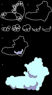
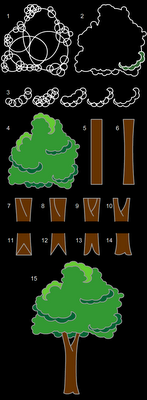
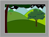
    Last week in class we put some of our flash skills—drawing, creating symbols, creating new layers—to work for us in creating an actual drawing, creating an actual scene of something recognizable, a landscape. To the right here, you will see a series of images of a couple things might go into creating a simple landscape, a cloud and a tree.

    TREE
    tree
    Last week in class we put some of our flash skills--drawing, creating symbols, creating new layers--to work for us in creating an actual drawing, creating an actual scene of something recognizable, a landscape. To the right here, you will see a series of images of a couple things might go into creating a simple landscape, a cloud and a tree.

     
    1. Creating a simple Graphic Symbol:
      1. Once you draw your cloud or tree, it should be converted to a symbol (F8) like many of the other much more simple objects we have draw thus far, ovals and rectangles mostly.
      2. To do so, after you have drawn your cloud, for instance, you must choose the selection tool (V) and select the entire cloud.
      3. Then select F8, convert to symbol.
      4. Give it the name cloud, select graphic for behavior and then click okay.
      5. Now you will see that it has a blue box around it when it is selected. If you de-select by selecting escape or by clicking on the background somewhere, you will see the blue box disappears.
      6. One thing you should remember is that since the cloud is now a symbol, you must not double-click on it, as this will take you into symbol-edit mode for the cloud.
      7. If you do wish to edit your symbol, then do double-click on it; however, you must remember to exit symbol-edit mode by clicking on Scene 1 in the upper-lefthand corner of the window.
      8. If you select F11 or ctrl-L the Library will open up. To close, you simply select F11 orctrl-Lagain. Once open, you will see a smaller representation of your circle symbol there. If there are more symbols, you will see them all listed there. Here is where your symbols are stored. What is on the stage is known as a symbol instance. It is like a clone, or a copy of what is in the library. Symbol instances may be deleted from the stage without affecting the symbol in the library. However, take great care of your symbols in the library. Do not delete the symbols from the library if you are using them in your movie. If you delete the symbols in the library, they will also be deleted from the entire movie.
      9. You may use as many symbol instances as you need. All you need to do is drag an instance from the library onto the stage.
      10. After you draw the tree, you should do the same and convert it into a symbol too (F8).

       
    2. Creating a Simple Landscape:
      1. If you haven't drawn your tree or cloud yet, or if you have not yet converted them into symbols, then look at the above exercise to do so first: LINK
      2. Once you have created your symbols, make sure that for now you have only one instance of each of them on the stage. Click one time on the tree and cloud to make sure they are symbols. If the blue box appears around them when they are selected, then they are probably symbols. Next, look in your library (ctrl-L) and make certain both symbols are there. If so, then you're all set, so delete both of them from the stage, but careful not to delete them from the library.
      3. Next, in the timeline, double-click where it says layer 1 and type the name ground
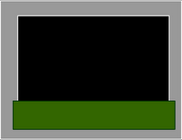
      4. Then, choose the rectangle tool (R) and draw a rectangle over the bottom part of the stage. Adjust the fill and stroke colors of the rectangle if you need to.
      ground

       
    3. Manipulating Layers:
      When creating an animation, it is important to put different objects on different layers, to segregate your content. This is important for several reasons, but primarily because there must only be one symbol per layer when using motion tweens.

      1. Now, lock the ground layer and add a new layer.


      2. Name this new layer, hills.


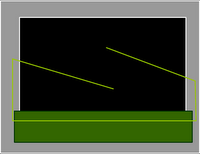
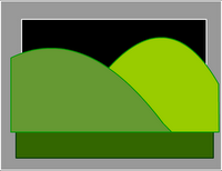
      3. Choose the line tool (N) and draw two diagonal lines above the ground rectangle as shown in the picture below.


      4. Continuing with the line tool (N) and starting with the end points of those two diagonal lines, draw a box over the ground rectangle.


      5. Once you do this, choose the selection tool (V) convert those two diagonal lines into curves.


      6. And continuing with the line tool (N), stretch the end of the lines so that they attach to each other to form a kind of upside-down W.


      7. Choose a new fill color and then, using the paint-bucket tool (K), fill in the two shapes with different colors. Notice that the one on the left is a little darker than the one on the right. Since we are creating a landscape, and since these are hills, it is good to note that as things get further away, they appear to get lighter. This is why the hill on the right is lighter than the hill on the left, because it is further away.


      8. Now, lock the hills layer, and create a new layer called mountains.


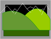
      9. With the line tool (N) draw a zig-zag line to mimic the outline of distant mountans.


      10. Further with the line tool (N) draw a box that connects the end points of the mountain lines and over-laps the hills.


      11. Choose a couple of light fill colors and using the paint-bucket tool (K), color in the mountains.


      12. Now, lock the mountains layer, and create a new layer called clouds.


      13. Open the, library (F11 or ctrl-L), and there you will see your cloud symbol.


      14. Drag several, cloud instances, from the library onto the stange.


      15. Change the size and shapeof the clouds using the free-transform tool (Q). Make certain they are small as they are in the background and far away.


      16. Lock all of the layers.


      17. Then, rearrange the layers to the following order: top-ground, 2nd-hills, 3rd-mountains, and bottom-clouds.


      18. Next, unlock the groundlayer.


      19. Using the selection tool (V) convert the horizontal line to a curve to make a kind of gentle slope.


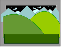
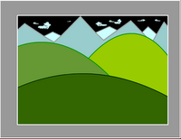
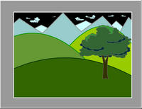
      20. Save and test (ctrl-enter) the movie, and it will look like the following image.


      21. Now, lock the ground layer.


      22. Add a new layer and name ittree-middle.


      23. Open the library (ctrl-L or F11), and drag an instance of the tree symbol onto the stage.


      24. Use the free-transform tool (Q)to resize the tree appropriately. Place it so that it rests on the nearest hill
      25. Now, lock the tree-middle layer.
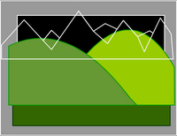
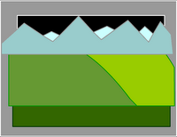
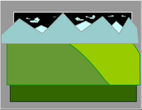
      hills 1hills 2hills 3hills 4hills 5mountains 1mountains 2mountains 3mountains 4layers 1layers 2
      finish 1tree 1tree 2


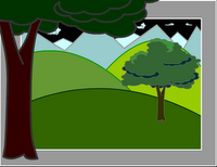
  5. Foreground & Background: When objects are placed in a landscape, to give the illusion of depth, they take on different sizes. Objects that are far away from the viewer, the camera, appear smaller. Objects that are nearer appear larger. To convey this relative size and relative distance, the free-transform tol (Q) is used to resize an object such as trees that are either further away or closer to the camera.
    1. Add a new layer and name ittree-near.tree 3
    2. Open the library (ctrl-L or F11) again, and drag another instance of the tree symbol onto the stage.
    3. Again, use the free-transform tool (Q)to resize the tree until it is much larger. It should hang off the edges of the stage significantly. Place it so that it rests along the left edge.
    4. Next, select this tree on the stage using the selection tool (V), open the properties bar, and click where it says color and select brightness. Make the tree darker as it is nearest to the viewer.
    5. Now, lock the tree-near layer.
    6. Open the library (ctrl-L or F11) once again, and drag a third instance of the tree symbol onto the stage.
    7. Use the free-transform tool (Q)to resize the tree until it is much smaller. Place it so that it rests on one of the background hills.

     
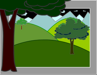
  6. Dim, Hazy Distance: To further provide an illusion of distance, objects that are further away from the viewer, from the camera, appear dimmer or lighter or hazier. This is due to the effects of the atmosphere and water-vapor. Color and symbol effects may be used to help provide this effect.tree 4
    1. Select this smallest tree on the stage using the selection tool (V), open the properties bar again, click where it says color and select brightness. Make the tree lighter as it is furthest from the viewer.
    2. Save and test (ctrl-enter) the movie, and it will look like the following image.
    3. Finally, you may also add these effects to the clouds, making them lighter, or, perhaps somewhat transparent with alpha.
    4. Save and test (ctrl-enter) the movie, and it will look like the following image.


  • SYMBOLS: There are three (3) different kind of symbol behaviors in Flash, but so far we have learned only about one kind, Graphic Symbols. We have used these symbol types primarily to create motion tween and to create re-usable graphics, graphics that may be used many times; however, there are many more uses for symbols, and last week's class was an introduction to another behavior type: Movie-Clip symbols.
    1. Movie-Clip and Graphic Symbols: The main distinction between these two types of symbols is that one is a dynamic symbol, and one is primarily a static symbol. In other words, one involves activity (animation) and interactivity, and the other involves in-activityor the lack of activity or interactivity. When a web graphic or object is dynamic, such as a movie-clip, it usually involves animation or user interactivity of some kind. Static graphics, on the other hand, are NOT usually active and NEVER interactive. They are static, still, non-moving, inactive.
      1. Graphic Symbols: Graphic symbols are the most basic symbol types. It is the only type that we have learned up to now, but it possesses all of the fundamental properties of symbols: they are reusable graphics, in which multiple instances of the symbol may be used without drawing more, and without adding filesize to your movie; they allow you to create motion tween animations, and they reside in the library (ctrl-L || F11). All types of symbols have these three fundamental properties, but a graphic symbol is probably the type that is used most often. As its name suggests, it is for graphics, any ordinary drawing or object that you would create in Flash. Some graphic symbols do contain animation within them; however, the vast majority will not.
      2. Movie-Clip Symbols: Next to graphic symbols, Movie-Clips are the most widely used type of symbol; and, in fact, for web-sites or interactive movies, they are perhaps even more widely used than graphic symbols. This type of symbol, being dynamic, often contains animation within it. Unlike simple graphic symbols, which usually contain a simple drawing of some type, movie-clips may contain within themselves entire animations. More often, however, they contain snippets of animation, brief animated sequences. Furthermore, one of the properties of movie-clips is that they may be allowed to play endlessly in a loop. As a result, those brief snippets of animation are played over and over and over again, such as an eye blinking, a raindrop falling, or a bird's wings flapping. If the sequence requires repetitive movement of some kind, then it is ideal for being placed in a movie-clip symbol. The blinking eyes here are an example:


        Notice that not only do the eyes blink repetitively, but they also move from side to side at about the same interval. What we have here are basically three (3) layers: an eyelid layer, an iris (colored part of eye) layer, and then the eyeball (white of eye) layer. The eyelid layer simply blinks, moving up and down; and the iris layer moves side to side. In these two layers are just two simple motion tweens. I've used the free transform tool (Q) also, to give the illusion of 3D animation, but it is really flat as a pancake 2D Flash animation. The bottom layer, the eyeball layer, does nothing, so it just has one keyframe and simply sits there at the bottom. All of this is inside a movie-clip symbol. We will cover something like this in another class, but feel try to try it on your own until then.
      creating star_mc 
    2. Creating a Movie-Clip Symbol: Next, we will create our own movie-clip symbol. Doing this is like creating the simple graphic symbols that we have made up to now. We will start first with a drawing:
      1. Using the line tool (N) or the polygon tool (R - press down on the tool until the polygon shows itself, then click on options in the toolbar to select STAR) to draw a star. It may be any type of star you like, 5 points or 6 points, fat or skinny.
      2. Once drawn, select the selection tool (V), look closely, and select only the stroke or outline of the star.
      3. Now hit delete.
      4. Make sure the selection tool (V) is still activated, and then select the star on the stage.
      5. Choose convert to symbol (F8).
      6. Give it the name star_mc, select movieclip for behavior, and then select okay.
      7. Once done, it should have a blue box around it just like a graphic symbol does when it is selected.
       
    3. Nesting Symbols: The star symbol is now a movie-clip symbol; however, it is not yet animated. We must create the animation inside of the symbol with symbol-edit mode.
      1. As you should know, to do this we must double-click on the symbol instance on the stage.stars_mc
      2. Once you do so, look in the upper left-hand corner of the stage. There, it should say Scene 1 - star_mc. This means you are in symbol-edit mode for the star symbol. If it is not there, you should try double-clicking again on the star on the stage. To proceed, you must be in symbol-edit mode.
      3. Now, select the selection tool (V) and select the star on the stage by double-clicking on it. Once you do so, you should be able to tell it is selected because it should have the little dots all over it.
      4. Eventually, we are going to put animation inside of this movie-clip symbol by creating a motion-tween. But as you can see, this star graphic has little dots all over it when it is selected, and as you know, it must have a blue box around it.
      5. Try not to get confused, but remember we are inside the movie-clip symbol. Try to imagine it as a completely separate movie inside the movie-clip, and if we are going to make this star into a motion tween, we need to convert it into a graphic symbol. But before we do, once again, look in the upper left-hand corner and see if it still says Scene 1 - star_mc to make sure you're still inside the symbol.
      6. If so, then make sure the star is selected, and then convert to symbol (F8).
      7. Give it the name star, select graphic and then click okay.
      8. Now, it should have a blue box around it when it is selected. This means you have a nested symbol. In other words, it is a symbol WITHIN a symbol. To see for yourself, double-click on the new symbol there on the stage. Then look in the upper left-hand corner again, and you should see Scene 1 - star_mc - star: the star graphic symbol is inside the star_mc movie-clip symbol which is in Scene 1 of the main movie.
      9. To exit symbol-edit mode, click on where it says Scene 1 in the upper left.
       
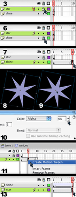
    4. Animating a Movie-Clip Symbol - Shining Star: Now that we have our symbols nested, a graphic symbol inside of a movie-clip symbol, we can go about creating our animated movie-clip.
      1. Select the selection tool (V) and double-click on the star on the stage to go into symbol-edit mode for the star_mc movie-clip.
      2. Once inside the movie-clip symbol, name the first layer star and add a second layer.
      3. Name the second layer shine and lock it
      4. Click in frame 1 of the star layer and copy (ctrl-C).
      5. Now lock the star layer and unlock the shine layer.
      6. Click in frame 1 of the shine layer and paste (ctrl-V).
      7. Now, click in frame 10 of the shine layer and add a keyfame (F6).
      8. Select the free transform tool (Q), hold onto the shift key, grab the corner of the star, and make it larger.
      9. After that, choose the selection tool (V) and select the star on the stage by clicking on it one time.
      10. Then open the properties bar, click where it says color, and set the alpha to zero.
      11. Now click in the timeline between the two keyframes, and add a motion tween.
      12. Also in the timeline, drag the shine layer so that it is below the star layer.
      13. Next, click in frame 10 of the star layerand extend the duration (F5).
      14. Finally, exit symbol-edit mode by clicking on Scene 1 in the upper left-hand corner.
      15. Save and test the movie, you will see your star shining over and over in an endless loop.


    5. Animating a Movie-Clip Symbol - Floating Note:

  • Friday, June 15, 2007

    Summer 2007

    week 5:
    evening—06/11
    morning—06/13

    Hi everyone,
    Below you will find steps leading you through what we covered in class this week, the drawings with the plants, the water, and darwing and animating the fish. Basically, we put together a number of things we'd already gone through to produce a quick little animation of something we can recognize, not just circles and squares but plants and fish.
        At this point, we are beginning work on our animations starting in our next class next week, so please do not fall behind in the homework. We're halfway through the term, and now the real work begins.

    Good luck! Carter-

    1. TOPICS:
      • LINK   Drawing Examples: Trees & Clouds
      • LINK   more on using Symbols
      • LINK   Composing a Setting: a Landscape
      • LINK   more on using Layers
      • LINK   more on Scaling Objects: Foreground & Background
      • LINK   more on Symbol Effects: the fading, hazy distance

    2. HOMEWORK: Using Flash 8, please download and look at frame 1 and frame 4 from the storyboard.

          Using those two frames as guides, please try to draw them yourself. They don't have to be perfect yet, but this is a first step in trying to create our animations due at the end of the term. Draw them in separate files, and do them quickly. If you have more time, you can always go back and make them look nicer. Try to remember to use layers—the stars in one layer, the moon in another layer, the notes in a third layer, and the title in a fourth layer for example

          Any kind of creative work and art is done by iteration and reiteration. This means, that you do something once, and then you go back and edit it, correct it, or redo it completely. And you continue to do this until you get it to the way you want or you run out of time.

      Good luck, work hard, and give yourself a little time to relax this weekend. See you next week. Carter-

      *** Please bring your homework to class. We will use the drawings in another in-class exercise. ***

    3. STORYBOARD: below you will find links to each of the pages of the storyboard containing 3-frames each.
      • LINK   Frames 1-3
      • LINK   Frames 4-6
      • LINK   Frames 7-9
      • LINK   Frames 10-12
      • LINK   Frames 13-15
      • LINK   Frames 16-18
      • LINK   Frames 19-21—not yet complete
      • LINK   Frames 22-24—not yet complete
      • LINK   Frames 25-27—not yet complete
      • LINK   Frames 28-30—not yet complete

       
    4. SETTING UP A SCENE:
      1. Creating and Naming layers:
        1. For the exercise we did in class this week, we first created all the layers we needed. Name the first layer water, and then lock it, and add a new layer.
        2. Name the second layer fish, lock it, and add a new layer.
        3. Name the third layer plants, lock it, and then UN-lock the water layer.

      2. Creating a Linear Gradient:
        1. Click in the water layer to make it the active layer, and select the rectangle tool (R).
        2. Open the color mixer, and in this panel, click on the little paint-bucket icon to select the fill color.
        3. Also in this panel, click where it says solid and select linear. This will allow you to create a linear gradient.
        4. Before we create, however, we must draw something: we are going to draw a rectangle without a stroke. To do this, you must first select the rectangle tool (R), which you probably already have done.
        5. Then, you must click on the little pencil icon underneath the word colors in the toolbar. This selects the stroke color so we can edit it.
        6. Then, just below this, you will see a small white box with a red slash. Click on this to turn off the stroke color.
        7. Now let's apply some color to our background using linear gradients. A gradient is a gradual change from one color to another. First, using the rectangle tool (R), draw a that covers over the ENTIRE stage. It is all right whatever color you choose for now, because we will change it with the gradients. Also, the rectangle should hang over the edges of the stage some. Don't try to draw exactly to the edge of the stage.
        8. Notice in the color mixer panel the horizontal bar below that shows a gradual change from one color to another, probably from black to white. This represents the gradient as it is right now. By default it is set from black to white.
        9. The gradient colors can be changed by manipulating the square boxes below the horizontal line. To change the color of one of them, simply double-click on it and the color selection panel appears.
        10. Choose a color that you like, and the gradient is altered. If you double-click on the other box, you can select its color also.
        11. Use the paint bucket tool (K) to fill the rectangle with the gradient, and the gradient transform tool (F) to rotate it so that it goes from light to dark from bottom to top. Choose whatever colors best represents water to you. Usually, the lighter color is on the top.

         
      3. Creating a simple Graphic Symbol:
        1. Once you complete your gradient, you should LOCK the water layer, and unlock the plants layer. Click in this layer to make it active.
        2. Utilizing whatever tools you like, draw a single plant that resembles seaweed to you.
        3. Once you draw your object, a plant, a fish, a cloud or tree, it should be converted to a symbol (F8) like many of the other much more simple objects we have draw thus far, ovals and rectangles mostly.
        4. To do so, after you have drawn your plant, for instance, you must choose the selection tool (V) and select the entire thing.
        5. Then chose F8, convert to symbol.
        6. Give it the name plant, select graphic for type and then click okay.
        7. Now you will see that it has a blue box around it when it is selected. If you de-select by selecting escape or by clicking on the background somewhere, you will see the blue box disappears.
        8. One thing you should remember is that since the plant is now a symbol, you must not double-click on it, as this will take you into symbol-edit mode for the cloud.
        9. If you do wish to edit your symbol, then you may double-click on it; however, you must remember to exit symbol-edit mode by clicking on Scene 1 in the upper-lefthand corner of the window when you are finished your edits.
        10. If you select F11 or ctrl-L the Library will open up. To close, you simply select F11 orctrl-Lagain. Once open, you will see a smaller representation of your circle symbol there. If there are more symbols, you will see them all listed there. Here is where your symbols are stored. What is on the stage is known as a symbol instance. It is like a clone, or a copy of what is in the library. Symbol instances may be deleted from the stage without affecting the symbol in the library. However, take great care of your symbols in the library. Do not delete the symbols from the library if you are using them in your movie. If you delete the symbols in the library, they will also be deleted from the entire movie.
        11. You may use as many symbol instances as you need. All you need to do is drag an instance from the library onto the stage.

         
      4. Symbol Effects:

        1. As you now know from the above steps, if you edit a symbol (using symbol-edit mode), then all instances of it will be edited to look exactly the same; however, you may change various properties of a symbol instance using the properties bar.
        2. Using the selection tool (V), click one time on one of the plants on the stage to select it. Its blue box should appear.
        3. Open the properties bar, look in the center where it says color, click and select tint.
        4. Select a tint color and a percentage. This will change alter the color of your symbol, the fish.
        5. Now click where it says tint again, but this time select advanced. Once you do this, click on the button that says options. If you alter the alpha here, it will have both the new tint color and be a bit transparent.
        6. You may also use the free-transform tool (Q) to change the plants so that each one has a somewhat different size and shape.
        7. There are other transformations possible in the modify menu. Just click on it at the top, and select transform. Try them all to see what happens.
        8. If you need to change the stacking order of the various plants; that is, if you want to put one plant below or above another one, you must also use the modify menu. Simply select the plant, and then click on modify menu and then arrange. Choose one of the options to alter the stacking order.
        9. When you have completed your underwater garden, then lock the plants layer.

         
      5. Animation:

        1. Now, unlock the fish layer and click on it to make it the active layer.
        2. Using whatever tools you like, draw a fish. When you choose one of the drawing tools, however, such as the line tool, pencil tool, or one of the shape tools, make sure that the drawing object option at the bottom is NOT selected.
        3. Once you have drawn your fish or sea creature, choose the selection tool (V) and select the entire thing.
        4. Make certain that the entire fish is selected and that no parts at all are left out, and then convert to symbol (F8).
        5. Type fish as the name, choose graphic for type, and click okay.
        6. Now, place the fish on the lefthand side of the stage, but it should be facing toward the stage in the direction that it will swim.
        7. We are going to make the fish swim across the stage over to the other side, just as we have done with the circle and square in past class; however, our fish is going to slow down and pause in the middle, before it speeds up and continues on its way to the other side. This means that we will have two pieces of animation, or two motion tweens: one for the fish to move to the middle of the stage, and then the second for it move off to the right side of the stage.
              So, to do the first half of the animation, click in frame 25 of the fish layer and add a keyframe (F6). You will probably notice that everything else disappears, the water and the plants. This is because those two layers only have the duration of one frame, and now, the fish layer has the duration of 25 frames. The fish layer lasts longer at the moment, but don't worry we will correct this in a moment.

        8. Next, move the fish so that it is in the center of the stage.
        9. Then, right-click in the timeline between the two keyframes in frames one and twenty-five, and select create motion tween.
        10. Now, click in frame 50 of the fish layer and add another keyframe (F6).
        11. Afterwards, this time, move the fish off the stage to the right side.
        12. Then, right-click in the timeline between the two keyframes in frames twenty-five and fifty and select create motion tween.
        13. If you press enter a couple of times now, you will see the fish move steadily across the stage. There is no pause in the middle. This is what we will do next.
        14. In the timeline, click in between frames 1 and 25.
        15. Then, open up the properties bar and locate where it says ease.
        16. Click there, and drag the lever all the way to the top until it reads 100.
        17. After, click in the timeline between frames 25 and 50.
        18. This time, in the properties bar change the easing until it reads -100.
        19. Select ctrl-enter to test the movie.


    Wednesday, June 06, 2007

    Summer 2007

    week 4:
    evening—06/04
    morning—06/06

    Hello everybody, Below you will find the posting for this week's class. It details all of the same issues that we covered in class, namely the drawing and animation. I have included here a lesson that we will cover in our next class of the fish. It covers much of what we did in class already, but if you have any difficulties or questions, please do not hesitate to email me or find me at TCI. We will go over it again in our next class.

    Regarding the Mid-term, please start working on your characters. Also, start practicing drawing the various scenes. Experiment with what you want things to look like. Starting in our next class we will be drawing more and more.

    Please, Please don't put things off. Carter-


    1. TOPICS:
      • LINK   more on Symbols and the Library
      • LINK   more with Motion Tween Animations
      • LINK   more on Color Gradients
      • LINK   more on Symbol Effects (brightness, tint, alpha) and their use in Motion Tweens,
      • LINK   more on Scaling Objects and their use in Motion Tweens
      • LINK   Easing Motion Tweens IN/OUT

    2. HOMEWORK:
      • Please complete the Flash drawings of two (2) of the characters of Hey, Diddle, Diddle by our class next week: the dog and the cow.
      • It is better that all of those character drawings are in the SAME Flash file, but not necessary. If you have drawn them in separate files, that is all right. Eventually, you will have to COPY and PASTE them from one movie to another.
      • Convert each of the character drawings into a graphic symbol.
      • Start thinking about coming up with a design for the title of the animation, "Hey, Diddle, Diddle". This is not due next week, but start to choose a font for the type, sizes for the words, and an layout on the stage.

    3. STORYBOARD: below you will find links to each of the pages of the storyboard containing 3-frames each.
      • LINK   Frames 1-3
      • LINK   Frames 4-6
      • LINK   Frames 7-9
      • LINK   Frames 10-12
      • LINK   Frames 13-15
      • LINK   Frames 16-18
      • LINK   Frames 19-21—not yet complete
      • LINK   Frames 22-24—not yet complete
      • LINK   Frames 25-27—not yet complete
      • LINK   Frames 28-30—not yet complete

       
    4. SYMBOLS and the LIBRARY: During the first four (4) weeks of class, you have been introduced to a vary important feature of Flash Graphics and Animation, creating Symbols:
      1. Creating a simple Graphic Symbol:
        1. Choose your stroke and fill colors.
        2. Set the thickness and type of your stroke.
        3. Choose the oval tool (O), hold onto the shift key and draw a circle.
        4. Choose the selection tool (V), and double-click on the fill of the circle to select both the fill and the stroke.
        5. Select F8 on the keyboard to convert the circle into a symbol.
        6. Type a unique name for the symbol, select graphic as the behavior, and then click okay.
        7. Once completed, a blue box will appear around the new symbol. This indicates that it is no longer an un-grouped object. If you double-click on it, you will be taken into symbol-edit mode. In symbol-edit mode, you will be able to edit your symbol. Once you have completed the edits, you must exit symbol-edit mode before you continue. To do this, click on Scene 1 in the upper-lefthand corner of the window.
        8. If you select F11 or ctrl-L the Library will open up. To close, you simply select F11 orctrl-Lagain. Once open, you will see a smaller representation of your circle symbol there. If there are more symbols, you will see them all listed there. Here is where your symbols are stored. What is on the stage is known as a symbol instance. It is like a clone, or a copy of what is in the library. Symbol instances may be deleted from the stage without affecting the symbol in the library. However, take great care of your symbols in the library. Do not delete the symbols from the library if you are using them in your movie. If you delete the symbols in the library, they will also be deleted from the entire movie.
        9. You may use as many symbol instances as you need. All you need to do is drag an instance from the library onto the stage.

         
      2. More with Motion Tweensfish drawing
          Hopefully, you can see that the use of symbols, symbol instances, and the library is not limited to circles. To the right is a quick demonstration of a drawing of a fish. This too can be converted into a symbol. But before we get to that, let's make the CIRCLE SYMBOL created in the previous exercise move around the stage:
        1. If you haven't created a symbol yet, then look at the above exercise to do so: LINK
        2. Once you have created your symbol, make sure that you have one instance of it on the stage, and only one instance. Click one time on the circle to make sure it is a symbol. If the blue box appears around it when it is selected, then it is probably a symbol. Next, look in your library (ctrl-L) and make certain the circle symbol is there. If so, then you're all set, so move the circle symbol instance just offstage to the upper-right corner.
        3. Next, in the timeline, click in a new frame, say frame 30, and add a new keyframe (F6).
        4. Now, on the stage, move the circle across the stage to the upper-left corner.
        5. In order to make sure that all is correct, let's check the keyframes. Click in frame one. Here, the circle should be just offstage to the upper-right corner. If it is not, then you simply need to move the circle to where it should be.
        6. Then, click in frame 30 in the timeline. In this frame, the circle should be in the upper-right corner of the stage. Likewise here, if the circle is not where it should be on the stage, you simply need to move it where it belongs.
        7. Finally, place the mouse over the timeline, in between the two keyframes over the grey area somewhere in the middle, and right-click.
        8. A menu should appear, so choose Create Motion Tween. LINK

         
      3. Gradientsgradient
        1. Now let's apply some color to our background using linear gradients. A gradient is a gradual change from one color to another. First, using the rectangle tool (R), draw a rectangle for the ground. It is all right whatever color you choose for now, because we will change it with the gradients. Also, the rectangle should hang over the edges of the stage some. Don't try to draw exactly to the edge of the stage.
        2. After you draw the first rectangle, draw a second one for the remander of the background. The color for this one will also be altered by the gradients.
        3. Next, open the color mixer panel.
        4. Notice in the panel where it says solid. Click there and select linear, and then next notice the horizontal line below that appears. It represents the gradient, and by default goes from black to white.
        5. The gradient colors can be changed by manipulating the square boxes below the horizontal line. To change the color of one of them, simply double-clip on it and the color selection panel appears.
        6. Choose a color that you like, and the gradient is altered. If you double-click on the other box, you can select its color also.
        7. Use the paint bucket tool (K) to fill the bottom rectangle with the gradient, and the fill transform tool (F) to rotate it so that it goes from light to dark from bottom to top.
        8. Repeat the previous 4 steps for the top rectangle.
        9. This will be the background of your animation, so name the first layer backgound and lock it.
        10. Add a new layer and name it fish.
        11. Place the fish graphic symbol that you created in this layer.
        12. On the stage, move the fish symbol to the middle of the right side of the stage.
        13. In the timeline, click in frame 20 and add a keyframe (F6).
        14. On the stage, move the fish to the center of the stage.
        15. n the timeline again, click in frame 40 and add another keyframe (F6).
        16. On the stage again, move the fish to the left-hand side of the stage.
        17. Now, place the arrow between frames 1 and 20, right-click, and select Create Motion Tween.
        18. Finally, place the arrow between frames 20 and 40, right-click, and select Create Motion Tween again.
        19. The final fish animation is here: LINK
        20. To add the easing click here: LINK

         
      4. Symbol Effects
          properties bar
        1. As you should already know, if you edit a symbol (using symbol-edit mode), then all instances of it will be edited to look exactly the same; however, you may change various properties of a symbol instance using the properties bar.
        2. Go to the previous movie with the circle, choose the selection tool (V), and click one time on the circle on the stage to select it.
        3. Open the properties bar, look in the center where it says color, click and select tint.
        4. Select a tint color and a percentage. This will change alter the color of your symbol, the fish.
        5. Now click in frame 30.
        6. Select the circle in the center of the stage by clicking on it one time.
        7. Open the properties bar again, and alter the tint color again. Click here to see the results: LINK

         
      5. Motion Tween Easing
          Motion Tween Easing is a tool that is used to alter the speed of an object through a motion tween. As in the fish animation above (and here), the fish slows down toward the middle, and then speeds off again, as if swimming against the rhythmic current of the ocean waves.
        1. Returning to the fish lesson, click in the middle of the first tween in the timeline, that is between frame 1 and frame 20 in the lavendar area.
        2. Next, open up the properties bar, locate the ease setting, click there, and select 100. This will cause the fish to slow down at the end of the tween.
          slow down
        3. Then, click in the second tween between frame 20 and frame 40, look in the properties bar again, and set the ease to -100. This will cause the tween to start slow and speed up toward the end of the tween.
          speed up

         
      6. Scaling Objects & Motion Tweens
          You should already be familiar with how to scale objects up and down (making them larger and smaller) using the free-transform tool (Q). However, you may not know that this can be combined with the motion tween to cause an effect which makes an object like it's changing size over the course of a motion tween.
        1. Let us return to the circle motion tween that was discussed earlier. Click here to see it: LINK
        2. Click here to see the instructions to create it: LINK
        3. To add a scaling effect to this little animation, first click in frame 1. This automatically selects the circle on the stage.
        4. Then select the free-transform tool (Q) and change the size or shape of the circle with it.
        5. Next, click in last frame. This automatically selects the circle on the stage again.
        6. And again, using the free-transform tool (Q), and change the size or shape of the circle with it. The circle will now gradually change shape and/or size through the course of the animation.
        7. View the final circle animation. Click here to see it: LINK